I’ve been wanting to write about this topic for a while now, and in stark contrast to everything else I’ve written, this applies to everyone who has ever used a computer. You don’t need to study HCI or programming to formulate your own UI-related ideas and pet hates. These are mine:
10.) Bad Search Functions:
There’s a simple rule here – if Google can search your website more adeptly than your search function can, you’re doing something wrong. If your search functions returns a million results and provides no way of narrowing down the results, you’re doing something wrong. If your search function is so painful that every search realistically requires several subsequent refinements with 30 second delays in between them, you’re probably pissing off your users. And this isn’t net specific either. Let’s face it; Windows search was pretty crap before 7.
9.) Bad CAPTCHAs:
I’m certain you know what a captcha is – it’s a Completely Automated Public Turing test to tell Computers and Humans Apart! Still don’t know? How about “notoriously annoying distorted image which supposedly contains legible characters, rears its ugly head whenever you try to register on a website and is apparently a good test of whether you’re a human or robot”? Yeah, now you’re with me. In all fairness, not all CAPTCHAS are bad and I think Google does a rather good job with their ones. But it’s hard not to hate them when you encounter monstrosities like this:
 I discovered it while trying to register on a well-known NZ site… it was lurking in the wild without a refresh function or audio aid. And to top it all off, it came with this message “If you are visually impaired or cannot otherwise read this code please contact the Board Administrator.” Really?!? I don’t think I need to be visually impaired to struggle with that one. Still, at least the reCAPTCHA folks are making the most of them.
8.) Deceptive Progress Bars:
Most people consider progress bars to be a farce, and it’s no surprise when they do wacky things such as jumping from 10% to 90%, going backwards, restarting an unspecified number of times, and generally being inconsistent.
Yes, there’s a plethora of challenges involved in developing a good progress bar (whether time or percentage based), but it’s not rocket science… try to do something so that your progress bar at least roughly reflects real progress. If you can’t programmatically estimate how much time will be required for chunks of program execution, perhaps a heuristic estimate based on test results would be more appropriate? Or perhaps a progress bar really isn’t required in the first place, when the user simply desires assurance that there’s at least something going on and that your app hasn’t crashed?
7.) Give Control to the User:
No-one likes waiting and a user should be dictating their computer’s operation rather than the reverse. This implies that users should have some degree of control over time-consuming processes – after all, it’s their time which is being sucked away. I’m baffled as to why Microsoft hasn’t added Pause/Resume functionality to file copy operations when it’s so obviously in massive demand. And unskippable cinematic sequences in games are definitely a no-no along with annoying splash screens.
But I feel the worst offender is iTunes. Adding music to your iPod entails a considerable number of processes – songs must be added to your iTunes library, converted if necessary and synced to your iPod. Then album art must be obtained and gapless playback information calculated. This is all quite hard drive intensive, which may be fine for power desktop systems but absolutely cripples my single drive laptop. Surely iTunes could provide a less intensive “Don’t ravage my computer as I’d like to be able to do other stuff at the same time” mode? Basically a background version of syncing?
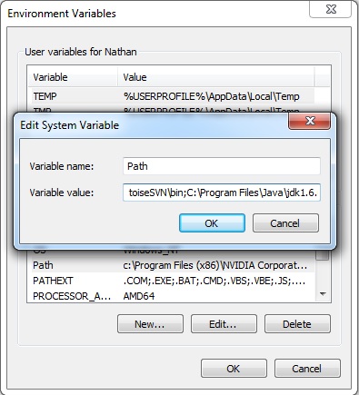
6.) Windows which Should Be Resizeable but Aren’t:
I have a 24″ widescreen monitor. The variable value there is 389 characters long. Only 42 characters are displayed as the textbox is inside a non-resizeable window. Enough said.


what would a java programmer know about user interfaces
Some Java programmers know loads about UIs and some know nothing. But I’m not a Java programmer.