5.) Meddling with OS Context Menus:
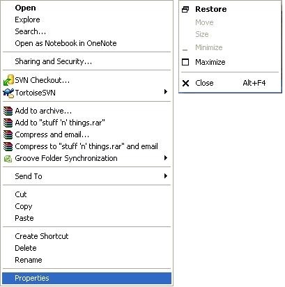
This is a simple one. The context menus on my system for folders and taskbar apps tend to appear as shown below. Through familiarity and perhaps muscle memory, my mind expects the last item on my folder context menu to be “Properties” and the last item on my taskbar context menu to be “Close”. So don’t develop an app which overrides this behaviour because it’s guaranteed to cause headaches. If your app needs to add an item to an existing context menu, add it in the middle so that the top/bottom items are preserved.

4.) Ignoring Platform Standards:
Microsoft Windows and all programs conforming to its standards, use the anchored model of selection. That’s to say that if you select one folder in Explorer’s list view (your anchor), and use SHIFT plus an arrow key to select more, the list grows in only one direction. A typical scenario exists where you select an item, expand your list by holding SHIFT+Down, and then hold SHIFT+Up to deselect a few of the bottom items because you realise went a bit too far and grabbed more than you wanted. The alternative to this, which is/was used by many Apple programs, is unanchored selection. SHIFT+Up expands your selection upwards and SHIFT+Down, downwards… your list always grows and cannot be shrunken.
Until recently, and much to my chagrin, the Windows version of iTunes used the unanchored model of track selection. The point I’m making isn’t that one is necessarily better than the other (although I do seriously question the rationale behind unanchored selection) – my gripe is that Apple blatantly opposed the usability intuitions of most Windows users. Perhaps they were trying to keep iTunes consistent across platforms? Perhaps they were trying to convert Windows users to the Apple way (unlikely since Apple didn’t have a UI guideline for this matter anyway)? Perhaps they didn’t even think about it? Either way, they’ve thankfully fixed it now.
Similarly, Windows dialogs traditionally have “Ok” on the left and “Cancel” on the right. Don’t develop a Windows app which contradicts this.
3.) Poor Menu Systems
Monolithic menu systems really aren’t cool. No-one likes having to trawl through massive extended menu sequences to access a program function. Especially when the menu is configured to disappear as soon as you accidentally mouse away from it. While the below menu isn’t an offender, the red arrow indicates the relatively narrow passage through which the user must move their cursor. Add a few more layers, and you end up creating a mousing obstacle course. And if us young’uns struggle at times, imagine what it’s like for older folk.
 And I don’t think I really need to delve into badly located/organised menu items.
2.) Me! Me! Me!
With the recent advent of cutting-edge multiprogramming in the 1950s and the emphasis on multicore processing nowadays, you’d think that application programmers would be vaguely aware that users like to multitask, and that their apps are usually not the only user process running on a system. Yet, we somehow still have to deal with a slew of impertinent attention-seeking programs. Programs which without asking, squat on your desktop, in your taskbar and in your start menu, and lodge themselves as browser toolbars. Programs which are incapable of being minimised without crashing (*cough* games), because “How could a user possibly want to switch to something else for a sec?”
Windows Live used to reduce itself to a tiny icon in the system tray when closed. On Win7, it insists on occupying at least two entire positions in your taskbar while open. As far as I know, the only workaround for this is to run it in WinXP compatibility mode. And I know everyone is fond of Norton and Windows Update popups… oh, and everyone loves web popups. As I’m writing this, iTunes is stealing my focus every ten seconds while it “updates my library”.
1.) Stealing Focus and Spawning Dialogs with Keyboard Shortcuts
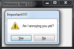
This is easily the most egregious breach of UI standards. If stealing focus alone wasn’t already bad enough, then we have this. Just think about it… you’re typing up an important letter to the Secretary-General of the UN and bam! An app decides it’s far more important than everything else you could possibly be doing on your system at the time, steals focus and spawns a dialog like this. Worse still, because you happened to be typing ‘y’, ‘n’ or Enter at the time, the dialog interpreted it as a shortcut for a button press and promptly disappeared along with its crucial question. So you have no idea what was so ‘important’ or what you just agreed/disagreed to. Best case scenario is that the characters you’re typing will not be keyboard shortcuts and will only result in an annoying stream of beeps. Worst case; it was a Windows Update restart prompt and you gave it the go-ahead to abandon ship and restart.


what would a java programmer know about user interfaces
Some Java programmers know loads about UIs and some know nothing. But I’m not a Java programmer.